When I am writing this text on my blog this Sunday morning I have no way of changing my font (if I don’t pay extra). The font I use – Georgia – was chosen by some pro designed at Devpress who designed the theme I am using for my blog.
My theme Origin is “a light, elegant theme with a minimalist look and feel, perfect for a blog or journal…the responsive design makes it a great fit for mobile devices and small screen sizes.” Microsoft released the first version of the font on November 1, 1996 as part of the core fonts for the Web collection. “Georgia is designed for clarity on a computer monitor even at small sizes, partially effective due to a large x-height. The typeface is named after a tabloid headline titled “Alien heads found in Georgia” (Wikipedia)
On the blog themes info page it says (in the font Time) that I can change Fonts, Colors with the Custom Design if I pay. I am happy with my theme, so for now I will leave it as it is. I seldom take the time to reflect on fonts and typefaces though but an interesting new program on the Swedish Public radio Typo is entirely about fonts has invited me into the fascinating world of fonts.
Usually when I write in word I write in Arial, Times New Roman or Cambria but sometimes I go wild anf find an exciting font such as Desdemona
![]()
Times New Roman is the most common font today according to Typo. In october 1932 the font was in print for the first time at The Times newspaper in London decided to get a new font to save space and money. The new font, Times New Roman, spreads quickly to other newspapers around the world. It is said that it is easy to read, but is it really? I don’t know maybe we use it just because it is default in word, when I use Scrivner I often write in Cochin since it is default in that program. But when a text is printed I do think more about the font for some reason.
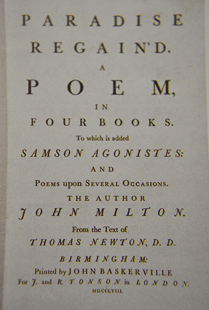
The Baskerville font was designed by John Baskerville and it revolutionized the art of printing, according to many. By using the new paper, new printing inks and new letters. “Adding a book printed by John Baskerville next to a contemporary book from the 1700’s was like adding a digital e-reader next to a one from the fifties… But it’s hard to be a hero in your own time.” Contemporary printers said that his letters were so sharp that it could damage their eyesight. It was also expensive to print and John Baskerville was forgotten after his death. Much later the font was picked up again and Baskerville is today considered a classic font for body text.
When Barack Obama won the presidential election in 2008, it was with words like Change, Hope and the phrase Yes We Can! These messages were written in the typeface Gotham. The font Gotham is therefore seen as a political winner in the twenty-first century.
Many designers have waxed admiringly about Barack Obama’s sophisticated typographical design scheme, particularly the consistent use in much of his graphic material of the typeface Gotham, designed by Tobias Frere-Jones. So I called Brian Collins, an expert on branding, to get his thoughts on what this “good design” means for the candidate.
Steven Heller, a respected graphic design commentator, interviews Brian Collins in New York Times: As a branding expert, can you tell me what it is about the typographical scheme of Senator Obama’s campaign that is unlike his challengers’?
Brian Collins: John McCain’s, Hillary Clinton’s and Barack Obama’s campaigns all make good efforts to brand their messages consistently. And that’s incredibly hard to do. Just imagine the thousands of volunteers and endless elements they must orchestrate from town to town, state to state. But as a result of their approach to design, the Obama campaign really stands out. From the bold “change” signs to their engaging Web site to their recognizable lapel pins, they’ve used a single-minded visual strategy to deliver their campaign’s message with greater consistency and, as a result, greater collective impact. The use of typography is the linchpin to the program. Type is language made visible. Senator Obama has been noted for his eloquence, so it’s not surprising that someone so rhetorically gifted would understand how strong typography is and how it helps bring his words — and his campaign’s message — to life.

Katherine Hepworth writes about Barack Obama, graphic design and liberal democratic process in the Re-Public, an online journal focusing on innovative developments in contemporary political theory and practice. She also refers to Stephen Heller who has pointed out that brand message achieved by the Obama campaign has rarely been seen in commercial enterprise, let alone in the far less design savvy world of political campaigning.
The love affair between design and liberal democratic politics is perhaps nowhere more evident in the world today than in the campaigning for the United States’ presidential election. The coverage of the races for both the election and the presidential candidate nomination for the National Democratic Party has been marked by significant local and international interest in the visual language employed by Barack Obama’s campaign. The winning effect of a sophisticated branding campaign incorporating graphic design on a level not seen before in American politics has not only had first time voters in thrall, but has charmed the mainstream and design press too (Re-Public).

The campaign typography demonstrates similar thought and restraint featuring, as it does, the controlled but elegant, all-American Gotham typeface. Typography, the way in which typefaces are selected and used, has phenomenal power of influence over any written communication. If ill-considered as in, say, the average word processing document, it can hinder a message. If well thought out it can add significant weight to the written word, supporting its meaning through countless small details that communicate subliminally but are ultimately effective. Sender LLC, Obama’s branding consultancy, know this. The well-chosen Gotham reflects the candidate’s values through its physical attributes and pedigree, an effect only heightened by the refined and staggeringly consistent way it has been applied to all campaign materials, even to the placards held by supporters at his rallies. The suitability of the typeface is even more remarkable when the hundreds of similar typefaces are considered, the overwhelming majority of which have their origins in 1940s old Europe. Stephen Heller, a respected graphic design commentator, has noted that the consistency of brand message achieved by the Obama campaign has rarely been seen in commercial enterprise, let alone in the far less design savvy world of political campaigning.
The typeface and the logo have been combined to happy effect in the highly customised campaign materials that are re-designed from state to state. Attendees of Obama rallies receive button badges, a fact which in itself is not so groundbreaking. The point of difference is that each variation contains a beautifully crafted piece of typography where the state’s initials crafted to be in perfect harmony with the Obama logo. The effect is one of considered localisation; the campaign belongs here, Obama belongs here, we (the campaign and yourself) are in union.
Yes, the word of typefaces is an interesting one and can be an important tool in trying to win a cause. At Sourceforge website you can download MS web fonts.
Related articles
- Which Word Wednesday: Font vs. Typeface (fillingmypatchofsky.com)
- Opinion Column: Why Won’t Helvetica Go Away? (smashingmagazine.com)
- TDC type-design competition 2012 (ilovetypography.com)
